Now we know.

David M

Very Active Poster
Registered User
Joined
Jan 29, 2017
Messages
3,160
The name David Kachel was new to me, so I looked him up. (Thank you.)
He was mentioned in the context of film developing, but there's more to him than that. He actually knows how to distinguish a fine art photograph from all others and he gives check-list of what to look for and what to avoid. (Actually, he gives three.) He must be a very clever person indeed.
It saddened me to discover that my own Pepper No.30 isn't fine art at all.
Let me explain.
It's printed right to the edges – "be sure to reject... any image printed out to or near the edge of the paper."
It's dry-mounted – " A print must never be glued, taped, dry-mounted, or in any way permanently attached to anything."
Matte board [...} – "four (usually) identical, nearly invisible plies (layers)." I haven't had the courage to peel apart my own mount but it doesn't look thick enough for four plies.
"Lastly, subject matter says it all." "Serious photographers {...] never list generic subject categories like landscapes, sunsets, flowers, pets, etc." Or Peppers 1-29?
There is more. All good stuff. Sadly for me, no more advice on subject matter.
You might like to settle, once and for all, that perpetual problem that all photographers wish would go away: Is it Art?
Here's a link:

 
Last edited:
The name David Katchel was new to me, so I looked him up. (Thank you.)
He was mentioned in the context of film developing, but there's more to him than that. He actually knows how to distinguish a fine art photograph from all others and he gives check-list of what to look for and what to avoid. (Actually, he gives three.) He must be a very clever person indeed.
It saddened me to discover that my own Pepper No.30 isn't fine art at all.
Let me explain.
It's printed right to the edges – "be sure to reject... any image printed out to or near the edge of the paper."
It's dry-mounted – " A print must never be glued, taped, dry-mounted, or in any way permanently attached to anything."
Matte board [...} – "four (usually) identical, nearly invisible plies (layers)." I haven't had the courage to peel apart my own mount but it doesn't look thick enough for four plies.
"Lastly, subject matter says it all." "Serious photographers {...] never list generic subject categories like landscapes, sunsets, flowers, pets, etc." Or Peppers 1-29?
There is more. All good stuff. Sadly for me, no more advice on subject matter.
You might like to settle, once and for all, that perpetual problem that all photographers wish would go away: Is it Art?
Here's a link:


He is certainly ... opinionated. But his writing on how film works, on local contrast, and on contracted development are very good.

My response to people who hold these doctrinaire position on aesthetics is, Show me your prints ...
 
Yes. I came to the Fine Art essay after reading his advice on printing.
Like you (and me) he’s very interested in micro- and mid-tone contrast.
In essence he advocates iterative bracketing of both contrast and exposure, over a long series of full-size prints, followed by a similar process for dodging and burning, until he funnels into the final print - the fine-al print, I suppose. Interesting. Not an engineer’s approach.
If he’d called his Fine Art essay: “Hints for buyers of photographs to hang on the wall.” I’d have been less astonished.
 
Last edited:
One gets reminded of the late Barry Thornton who was excessively up his own backside, it's more interesting how the great photographers work who produce consistently good results. I'd include the Westons, Minor White etc, and in his later years Ansel Adams.

Reality is maybe in more recent yeras we should look at Alan Rosss, John Sexton, John Blakemore, John Davies, (plus many others), and they have full controls without the methods put forward by people more interested in false trickery.

Ian

As I have become of a more ... seasoned (yeah, that's the word) age ... I've come to understand there there is often no One True Way for getting things done. Process is an intersection of the individual's mind, spirit, and craft and often cannot be bridged to others. We can learn from the craft of others, but we have to make it our own.

Sherman gets great results with EMA but is frequently pilloried for suggesting these results work. Kachel has contempt for low agitation methods, thinks he knows what the definition of a fine art print is, but himself makes lovely prints. Some people advocate esoteric developers. Some use contrast masking, and some - shudder - use digital post processing (I kid, I kid). I know of one guy who still swears by overnight development to completion in D-23.

In all the aforementioned cases, I first look at the character and spirit of the individual and then their work. For example, both Sherman and Kachel have been generous with me in providing feedback via private emails when they had absolutely no reason to do so. Both make lovely prints. Neither likes the others' process. Similarly, you and others here have been generous with your time and commentary to share how you work.

I also think that some of this is simply a matter of taste. I am a long time devotee of Classical Music. I note that Stravinsky is an important figure in that music. I also cannot stand his material (mostly). That doesn't make him bad and it doesn't make me wrong. It's. .. a matter of taste. I mention this because you mention both Sexton and Blakemore as exemplars of fine photographers. I stipulate that this is true by every ordinary definition of "fine". However, I find most of their collective body of work uninteresting and non-emotive. That doesn't make them bad and it doesn't make me wrong, It's ... a matter of taste.

P.S. I've only ever seen Sexton's work in books and Blakemore's on a monitor - a horrific way to view art. So I reserve the right to change my mind if I ever get to see the real thing. Then again, it's the only way I've seen Kachel and Sherman's work and I do find their work evocative and powerful.
 
Last edited:
There’s some interesting and useful observations in his essay on printing. He suggests that burning is easier and more flexible than dodging, so your basic exposure should be reduced to account for this.
He recounts John Sexton’s practice of tearing pieces out of differently exposed prints to visualise other possibilities. I like that idea, not so much for the aesthetic opportunities, but because it removes excessive preciousness.
As for the Fine Art advice, he‘s really just telling you to check the tread in the tyres, the rust under the wheel arches and that the wipers and lights work properly. It’s mostly about workmanship and value-for-money. Where does that place The Last Supper? Or Banksy?
As we all have some sort of idea that art has universal qualities, I do wonder how it relates to sculpture or, perhaps poetry.

The one quality that great art must have, is also the most impossible one to measure: Will it endure? At best, we can guess but none of us will live long enough to really know.

I note with wry amusement that fans of Elvis, The Beatles, and The Sex Pistols all think their band is the best one ever even as all three have begun their descent into eventual obscurity, already showing a decreasing cultural relevance even in their own lifetimes. I am enough of a music snob that I could have (and did) predicted this years ago.

What's harder - MUCH harder - is figuring out what will last. We know what HAS lasted, but not what will. Mozart? Check. Bach? Check. Shostakovich? Check (so far). Banksy? Billy Strayhorn? Miles Davis? Lady Gaga (no chance, I'm pretty sure).

So I remain content with the idea that I make art first and foremost for ... me. If someone else likes it, that's nice, but that's not my audience. This simplifies the topic but it makes it miserable to do ... I am perpetually unhappy with my output...
 
@thronobulax. I have no issue with these techniques they work but are just unnecessary.

Put more simply the great well known photographers out there get highly consistenent superb reults without using them. And then these guys do no better, it's mostly ppie in the sky.

The way I was taught after I larely knew anyway was just go out an nail it in one exposure, that came from Peter Goldfield via Minor White and Paul Capenigo. It's so easy you get good negatives that print very easily (or scan :D

Why make it difficult, I always get what I've seen ansd it's easy none ot this mumbo jubo.

Ian

So, I have to ask - and I am not being argumentative, but genuinely curious as to your process - how you handle this scenario:
  • You are in the deep woods with light spilling through the trees and illuminating a running brook with sparkling highlights.
  • When you place the exposure for the darkest moss on Zone III, the highlights of the water end up on Zone XIII - a 10 stop SBR.
  • You have no hope of burning in the highlights on the water during printing because they are tiny little flecks of light in relatively small portions of the print.
  • The tree trunks in the foreground dominate the scene, but only show 1-2 stops of range of light in the mid-tones - i.e., They show limited local contrast.
  • The exposure requires enough time that you have to account for reciprocity.
How do you simultaneously: A) Hold the shadow detail, B) Keep the highlights from blowing out, and - very importantly - C) Expand the mid-tone local contrast?

My experience is that I can do A & B any number of ways. But if I also have to do do C at the same time, the wheels come off. Kachel has noted rather trenchantly that Adams and the Zone system progenitors with just wrong about how to handle this. Contracted development will keep the highlights from blowing out but that requires more exposure. If you are already in reciprocity failure, you'll need even more, but then you have to contract development more. You balance that see-saw until you strike the right amount of exposure and limit the development properly. Unfortunately, in limiting development that much for contraction, the mid-tone local contrast gets destroyed.

His answer is to use something like SLIMT. My answer is to use limited agitation techniques which absolutely will produce all three required results simultaneously. I believe I have shown scans here that demonstrate exactly this. I am genuinely curious as to how you approach this and make the "singing" print.

P.S. It's worth noting that I am shooting for silver prints. I am well aware that a pure digital post process can fix all manner of sins in other ways which might obviate the need for some of the "mumbo jumbo".
 
What endures? Routine wall-painting in Pompeii, grave goods everywhere, Gilgamesh, Stonehenge, Pythagoras’ Theorem...
 
What endures? Routine wall-painting in Pompeii, grave goods everywhere, Gilgamesh, Stonehenge, Pythagoras’ Theorem...

Well, yes, pottery and stonework tend to survive the ages, but whether that's art, let alone good art, is arguable. But point taken - since they have survived, they are at least candidates. Incidentally, that would also include some of the pubs in rural England I have visited :)

I was thinking more like: Homer, Socrates, Plato, Artistotle, Sun Tzu, Bach, Mozart, Beethoven, Van Gogh, Rembrandt, Michelangelo, Shakespeare, the Taj Mahal ... that sort of thing.

It may be difficult to fully understand why, but there is some reason that Odyssey remains relevant some 2700 years after its writing. There is some reason why Bach's St. Matthew Passion remains one of the greatest, and most treasured products of Western Art over the past 400 or so years. It's not that durability itself is the measure of the art. It's that the greatness of the art produces durability. I wish I knew what the formula for that greatness was. I rather suspect we all do ...
 
There are certainly some things we’d mostly agree on. As you say, the details may vary. I do endorse your point that to recognise excellence is not necessarily to like it.
Chance must play a part. Consider all those “...mute inglorious Miltons”.
That’s not quite my point. We can be pretty sure that neither the Odyssey nor Tutankhamen’s mask came within a million miles or a thousand years of four-ply acid-free archival mount board, and yet... and yet...
Now I begin to wonder about originality. Music students are (or were) given exercises to write music in the style of JSB. I have no doubt that some of them were excellent, some even up to the standard of the master. If we don’t know, do we enjoy them as much?
This issue is clouded, in photography, by the conventions of collecting. A poor print, made about the time of exposure can be much more valued than a much better one made later or by another and more skilled hand.
...and thinking of originality leads me back to the ubiquitous Mr Adams. There does seem to be a very adequate supply of precisely-exposed, meticulously processed, beautifully-printed, full-tone, archivally-mounted variations of his subject-matter and style being produced, by enthusiastic and dedicated photographers even today. No reason why they shouldn’t do this. We all sing songs and cook dishes that someone else devised.
 
Last edited:
It seemed reasonable to look more closely at Mr Kachel’s work.
I did that.
His subject matter seems fairly conventional for a US photographer. The Solo Favourites page made me think that he’s seen an Adams, an Evans and a Weston.
I‘m very sorry to report that his printing style reminds me of what my iPhone promises to do with one click, if only I download the appropriate app. This is from viewing on my screen and I’m reporting on my own very short-term reaction, not making a considered judgement. The viewing experience may be entirely different in real life, of course. A great deal of subtlety is lost on screen. That almost goes without saying.
My apologies if any of this upsets anyone.
 
It's funny how actually seeing a physical print can change your understanding of a photographer's work. I have seen both Ansel Adams and Edward Weston prints "in the flesh" . Both are photographers whom I've much admired over the years. When I saw the Adams print, I thought, I could do something of comparable quality. When I saw the Weston, I was in awe. My immediate reaction was, I will never do anything of this calibre.
 
...I have to ask...how you handle this scenario:
  • You are in the deep woods with light spilling through the trees and illuminating a running brook with sparkling highlights.
  • When you place the exposure for the darkest moss on Zone III, the highlights of the water end up on Zone XIII - a 10 stop SBR.
  • You have no hope of burning in the highlights on the water during printing because they are tiny little flecks of light in relatively small portions of the print.
  • The tree trunks in the foreground dominate the scene, but only show 1-2 stops of range of light in the mid-tones - i.e., They show limited local contrast.
  • The exposure requires enough time that you have to account for reciprocity.
How do you simultaneously: A) Hold the shadow detail, B) Keep the highlights from blowing out, and - very importantly - C) Expand the mid-tone local contrast?...

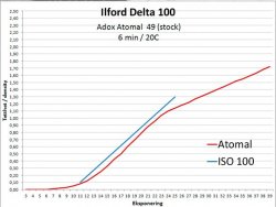
I'm not Ian, and it won't expand mid-tone contrast, but my answer to most of these challenges would be Delta 100 in Atomal. See attached. I've recently become very enamored of that combination.

Delta 100 Atomal.jpg
 
Yes, it is a limitation.
If I may take your own Lone Tree as an example. The tree's bark is well rendered with excellent detail, but on two of my screens the snow is reduced to featureless pale grey, with shadows. From what you've said, I'm pretty sure that there's more to see in the real print. A pity.
One other thing that screen viewing makes us forget is the actual surface of the paper, and for me, its heft.

Yes, both the print and negative show considerably more detail than the image here does (not to mention sharpness).

The biggest problem with the screen is that it emits light whereas a print reflects light. There is just no way for these to ever be equivalent. This is why I maintain that Digital Photography and Analog Photography are very distant cousins and essentially entirely different artforms. They work in fundamentally different ways. In my mind, they are as different as painting and sculpting.
 
Last edited:
I'm not Ian, and it won't expand mid-tone contrast, but my answer to most of these challenges would be Delta 100 in Atomal. See attached. I've recently become very enamored of that combination.

View attachment 2355

Since I have used neither Delta 100 nor Atomal, I hope you will indulge a little followup question. Do you see this as being different than any other conventional compensating developer like, say, D-23 1:1 or is it just a matter of it being a combination you understand well and thus can use effectively?

The more I've travelled this path of exploration over the past few months the more I have had a long held view confirmed: There are many ways to achieve results and no one workflow is necessarily better. The "best" workflow is the one you best understand.
 
I'm not Ian, and it won't expand mid-tone contrast, but my answer to most of these challenges would be Delta 100 in Atomal. See attached. I've recently become very enamored of that combination.

View attachment 2355

I'd agree Sal on that choice of film, Delta 100 is a superb film, of course this is a revised form of Atomal as the original developing agent went out of production, it had an industrial use outside photography. I've not used any version of Atonal mainly because I rarely change developers and have found Delta 100 and Pyrocat HD a superb combination.

To @thronobulax in answer to his questions I find that at half box speed and in Pyrocat HD at 1+1 to 100 high contrast situations like you mention are easily controlled, part of this is because the greater the developent the greater the stainng and that helps prevent highlights getting blocked up. I've posted examples for you in the past.

Like David M I've looked at David Kachel's websites (his Red Door gallery via Wayback Machine/Internet Archive), I don't find his writings match his images - which just aren't my cup of tea.

In comparison I think Steve Sherman's images superb although I don't totally agree with his EMA techniques as I find I get excellent results anyway without needing to reduce agitation.

A better way to handle extreme contrast is by increasing developer dilution, this was a technique recommened by the late Peter Goldfied using Rodinal with APX and Tmax films. We are also forgetting that we can make adjusments using printing controls where we reduce film contrast in exposure and processing.

Ian
 
...Do you see this as being different than any other conventional compensating developer like, say, D-23 1:1 or is it just a matter of it being a combination you understand well and thus can use effectively?...
While I've not used D-23, I have tried many other films and developers, including Perceptol at 1+1 and 1+3. While a lot of them shoulder off, it's usually at a higher density, and with sagging low values (a classic "S"), thus only slightly reducing the need for darkroom heroics when printing. The curve of Delta 100 in Atomal is very linear for low values and changes slope at just the right point to match paper's reflective range.

The Web site from which I grabbed that plot shows characteristic curves for many film-developer combinations


which can be interactively selected. Some have complained that its images are not well scanned, but I find the curves more useful than any screen-displayed image.
 
Back
Top