
Install the app
How to install the app on iOS
Follow along with the video below to see how to install our site as a web app on your home screen.

Note: This feature currently requires accessing the site using the built-in Safari browser.
-
Thank You For Visiting... Please Click Here and sign up to contribute and reply to posts and download the resources.
You are using an out of date browser. It may not display this or other websites correctly.
You should upgrade or use an alternative browser.
You should upgrade or use an alternative browser.
look through
- Thread starter martin-f5
- Start date

- Joined
- Dec 19, 2017
- Messages
- 3,525
I despair Martin.
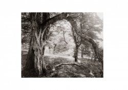
Your uploaded images have Zero highlights, are dismally dark, I very much doubt they are remotely representative of your actual images. A number of us have said this before.
It's why you get no comments, we just don't understand why, it has to be how you have your PC/MAC monitor setup.
Ian
Your uploaded images have Zero highlights, are dismally dark, I very much doubt they are remotely representative of your actual images. A number of us have said this before.
It's why you get no comments, we just don't understand why, it has to be how you have your PC/MAC monitor setup.
Ian

- Joined
- Dec 19, 2017
- Messages
- 3,525
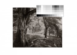
It shows the highlights are incredibly blocked up, something strange is going on.
Ian
- Joined
- Dec 19, 2017
- Messages
- 3,525
That's interesting - I was going to say the highlights look blown out to me but on instagram they don't appear to be so perhaps it's something to do with the hosting?
The highlights do seem to be blown out, however they are also way too dense, and there's a huge difference in sharpness between the Instagram image and the one here, plus they are different negatives.
I had an issue similar to this, an image could look great on the monitor in my darkroom, but way different on my Laptop or iPad. I resolved the issue by buying two new monitors (second hand - I use dual screens)
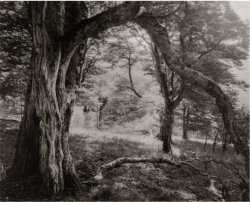
I just dimmed my screen and developed a new one,
please check and let me know if this works better
View attachment 3389
That's a vast improvement, now looks correct.
Ian

- Joined
- May 7, 2022
- Messages
- 87
Maybe I am missing something, I looked at the original image and liked it a lot !!
- Joined
- Aug 6, 2016
- Messages
- 665
Technically it not right, artistically I like the look as well, however, might not have been the look Martin f5 wanted it to look like when posted
- Joined
- Dec 19, 2017
- Messages
- 3,525
I'm largely analogue, it is probably something simple, maybe a Colour space issue.
I don't use Mac's but there's something critically wrong somewhere, why are the images looking fine on Martin's Macbook but awful online. Is it a colour space issue ?
I'm 100% sure what I'm seeing is not what Martin wants . . . . .
Technically it not right, artistically I like the look as well, however, might not have been the look Martin f5 wanted it to look like when posted
I don't use Mac's but there's something critically wrong somewhere, why are the images looking fine on Martin's Macbook but awful online. Is it a colour space issue ?
I'm 100% sure what I'm seeing is not what Martin wants . . . . .
- Joined
- Aug 6, 2016
- Messages
- 1,714
One of the main issues is that the image is Un-Tagged, it doesnt have a profile attached to it.
It needs to be saved with sRGB Embedded for browsers
It needs to be saved with sRGB Embedded for browsers

- Joined
- Sep 22, 2017
- Messages
- 302
it's a jpg print output from Light room.
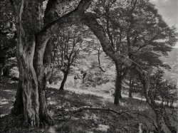
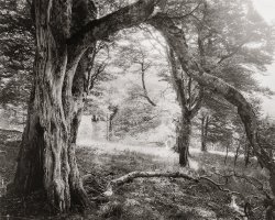
Here's a jpg export from LR
and here a mobile phone shoot from location
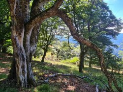
the mobile phone comes directly from the phone and wasn't edited but it shows a compressed version which isn't what I've seen on location
Here's a jpg export from LR
and here a mobile phone shoot from location
the mobile phone comes directly from the phone and wasn't edited but it shows a compressed version which isn't what I've seen on location
- Joined
- Aug 6, 2016
- Messages
- 1,714
@martin-f5 when you have exported the image from LR there is no profile attached to it. Tick the sRGB box in the export dialog
- Joined
- Aug 6, 2016
- Messages
- 1,714
@martin-f5 is this scan of the negative or a scan of the darkroom print
I’m not able to comment on colour space, but one thing I’ve found is that I prefer different levels of screen brightness for different things - reading text, editing a document, watching a video, editing images or printing. My solution has been to take an unsatisfactory print and match my screen brightness to it, then make further adjustments at that level.
I realise we are discussing on-screen rendering , but could this be a partial solution?
I realise we are discussing on-screen rendering , but could this be a partial solution?
