Roche Abbey Yorkshire

Ian-Barber

Admin
Registered User
Joined
Aug 6, 2016
Messages
1,714
The photograph was made on Ilford FP4 and printed on Ilford MG 7x5 Pearl Paper.

For some reason, the scanned image looks different to the print. The contrast in the print is higher. Now usually I am fairy confident with scanning but this has me baffled. Could it be the Pearl finish paper.
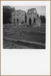
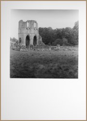
Scan.jpeg

Scan.jpeg
 
Pearl finish doesn't scan well at all, for print scanning I always use RC Glossy paper. I find glossy FB papers don't scan that well and are better re-photographed with a DSLR.

Ian
 
It must be something to do with the reflectiveness of the paper surface. Looks as though I have going to have to try and make a Jig for the DSLR
 
Yes, it's almost certainly the pearl paper. Pearl paper had a three-dimensional surface. Each bump is very large compared to a photon and the micro-surface is quite shiny. As the scanning head travels across each bump and hollow, it reflects light from different parts of the curved surfaces in succession, generating randomly scattered light.
Paintings are sometimes photographed in side-lighting to reveal the brushwork rather than the image and this is a similar kind of effect.
You will have ruled out other possibilities like condensation or dust on the glass.
 
With this print, I photographed it with the DSLR to see if there was any difference

_IBP4253 copy.jpg
 
That looks better, although some might consider that it's still a bit flat.
Is the dark crescent in the sky caused by the paper being curved?
 
What kind of tool are you using for the burn?
 
Hmmmm... You should have been able to get a nice even gradation by moving it up and down during the burn. It's best to make several up/down passes if possible, in the time available. Holding the card higher gives a softer edge. I had wondered if you were using your hands, as many printers do. It's something that's convenient because you always know where your hands are, but it does need practice.
Many printers like to burn in all the edges very, very slightly. It's said to "contain" the image but it shouldn't be noticeable. If it was obvious, we'd call it vignetting and have to do it differently.
 
Back
Top