Old Factory

thronobulax

Very Active Poster
Registered User
Joined
Aug 29, 2020
Messages
1,368
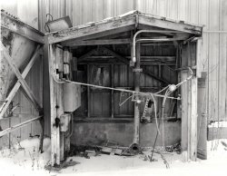
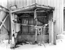
From one of my test negatives shot during recent still development experiments.

FP4+ EMA developed in Pyrocat-HD 1.5.:1:200 for 30min total time - 3 interval agitations
Speed Graphic, 127mm f/4.7 Ektar Lens

Original scene was very, very, very, flat gray with in subject centre with dark shadows in back on III and foreground snow in VIII. Note the mid-tone contrast expansion that EMA provided. The negative looks thin, but prints beautifully...
 

Attachments

  • 3Negs-EMA-Print-Sm.jpg
    3Negs-EMA-Print-Sm.jpg
    191.6 KB · Views: 66
This is just the sort of subject that I like to photograph, and I think you have probably done it well. But it is just too pale overall on my screen to tell. It's not my screen that's the problem. Martin's photo, "layers" looks perfect.

Alan
 
This is just the sort of subject that I like to photograph, and I think you have probably done it well. But it is just too pale overall on my screen to tell. It's not my screen that's the problem. Martin's photo, "layers" looks perfect.

Alan

Yes, I'm still fiddling with the interpretation. Very often when something seems too "light", what's really wrong is that it lacks contrast and vice versa. In this case, the lower zones need to be more intense, I think. But on my calibrated monitor, this doesn't wash out, so perhaps a difference in eyes accounts for it.
 
If your photograph looks good to you and you are pleased with it, then that's all that matters. But you have been experimenting with semi-stand development in an attempt to make the mid-tones look better with more contrast, and I think you are interested in comments about this. Two things would help people to form an opinion on this. One would be a comparison print, done from a negative that had been given standard development. And the other would be if we could see a photograph with the right tonal values. This one is too pale, unfortunately. If the original print looks good to you then the problem is obviously something to do with monitor display. Something that is beyond me. I'm sure Martin and Ian can help.

Alan
 
If your photograph looks good to you and you are pleased with it, then that's all that matters. But you have been experimenting with semi-stand development in an attempt to make the mid-tones look better with more contrast, and I think you are interested in comments about this. Two things would help people to form an opinion on this. One would be a comparison print, done from a negative that had been given standard development. And the other would be if we could see a photograph with the right tonal values. This one is too pale, unfortunately. If the original print looks good to you then the problem is obviously something to do with monitor display. Something that is beyond me. I'm sure Martin and Ian can help.

Alan

Unfortunately, I don't have a normally developed negative of the scene.

When it comes to monitors, there are a number of known issues when trying to assess the results of others:

  • The monitors need to be calibrated with a colorimeter to a matching colour temperature.
  • Ditto the scanner.
  • The monitors needs to have matching brightness
  • A monitor projects light. A print reflects it. Getting that to match is a real challenge.
  • A physical print will look different under different lighting conditions. Matching this on a monitor is ... challenging.
I did go back and look at the actual print and tried to produce an adjusted image that more nearly matches the actual print. I've attached the result to see if you find it more satisfying.

Your time an comments are appreciated.
 

Attachments

  • 3Negs-EMA-Print-Sm-1.jpg
    3Negs-EMA-Print-Sm-1.jpg
    197.7 KB · Views: 29
  • Like
Reactions: Diz
Yes, this looks better, in that I am guessing it is a better match to your actual print.
I really like this. Strong abstract shapes. Dereliction. My sort of subject, as I said earlier.

Alan
 
Yes, this looks better, in that I am guessing it is a better match to your actual print.
I really like this. Strong abstract shapes. Dereliction. My sort of subject, as I said earlier.

Alan

My wife claims that I have an unnatural attraction to dilapidation. She is not wrong.
 
It could be with lots of snow reflecting light into the subject giving the appearance of been to light, the second version is more appealing, however it is subjective, I don't mind either to be honest
 
It could be with lots of snow reflecting light into the subject giving the appearance of been to light, the second version is more appealing, however it is subjective, I don't mind either to be honest

The interesting thing about this scene is how it actually looked in the moment. (I wish I'd at least shot a digital image of it for comparison.) The light that day was an extremely flat grey after a major snowstorm and with full cloud cover still in place. There was some diffuse light from the cloud-covered sun in frame right. The opening in the upper left corner of the shed was on Zone III and the snow was on Zone VIII.

However, the interior of the shed was a very flat, uninteresting and low SBR grayish mess. N+ development would have opened up those mid-tones, but at the expense of shoving the snow onto Zone IX or X. That's why I used EMA.

I do also have negatives of the exact same moment processed with Stand and Semistand since this was part of various experiments in the matter. While I have yet to print them, by observation, these appear to have more inherent overall contrast.
 
I have used his methods with some success following Shermans EMA times, dilutions and agitations and it does work, it certainly has worked in this image, the tones are beautiful the image is open (breaths) and has an apparent sharpness, even at this forum size
 
Just a bit more on this as I've done further exploration. I shot the scene above multiple times and processed it 3 ways: Stand, EMA, and Semistand.

I have pretty much concluded that stand is completely unworkable with modern films, at least not on any consistent basis.

You see the EMA results above.

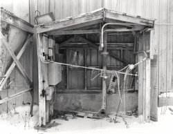
Here is a scan of the silver print of the Semistand processed negative This is not perfectly density matched with the EMA print scan but some observations:

  • The Semistand negative shows considerably better mid-tone local contrast
  • This is almost certainly due to using the same Pyrocat-HD dilution for both: 1.5:1.200. That is too dilute for the much shorter EMA times I used.
  • I am getting very good EMA results now with 1.5:1:150 with an initial vigorous 2min agitation and 15sec again at 12 and 21 minutes, with a total time of 30 mins.

Keep in mind that all my testing was about coming up with a way to control very large SBRs while not destroying mid-tone local contrast. To that end, I am currently looking at D-23 1:1 vs Pyrocat-HD EMA vs Divided Pyrocat-HD. The results are very promising. It may turn out that one can skip the complexity and time of EMA and Divided and just use D--23 1:1. The negatives are drying now but I am seeing very good results in a scene that had deep shadows on III and upper highlights on X.
 

Attachments

  • 3Negs-Semistand-Print.jpg
    3Negs-Semistand-Print.jpg
    187.9 KB · Views: 10
Last edited:
Back
Top