
Install the app
How to install the app on iOS
Follow along with the video below to see how to install our site as a web app on your home screen.

Note: This feature currently requires accessing the site using the built-in Safari browser.
-
Thank You For Visiting... Please Click Here and sign up to contribute and reply to posts and download the resources.
You are using an out of date browser. It may not display this or other websites correctly.
You should upgrade or use an alternative browser.
You should upgrade or use an alternative browser.
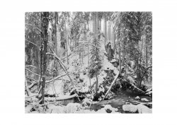
Winterscene, Fomapan 100
- Thread starter martin-f5
- Start date

- Joined
- Aug 29, 2020
- Messages
- 1,368
Linhof Technika, 90mm Grandagon
Fomapan 100, f32, 6sec, Rodinal 1+50
Scan with Fuji XE3
View attachment 2923
(why do I lose sharpness showing it here?)
You lose sharpness because the algorithm that posts here is reducing the size the image and thereby losing fidelity. This is expected from compressed JPG files.
For things I want people to see at full resolution/fidelity, I post them on a publicly accessible web site - either one of my own (I am a techno nerd) or any number of free public sites like Google Drive or MediaFire.
- Joined
- Aug 6, 2016
- Messages
- 665
Must be something your doing in re sizing, other than that I like, looks and feels freezing as I’m sure it must have been, hope we get some snow in UK , love going out with cameras in it
- Joined
- Aug 6, 2016
- Messages
- 665
I don’t seem to get this poor resolution posting on any forums, it’s nothing to do with the the board it’s how there prepared and sized before postingYou lose sharpness because the algorithm that posts here is reducing the size the image and thereby losing fidelity. This is expected from compressed JPG files.
For things I want people to see at full resolution/fidelity, I post them on a publicly accessible web site - either one of my own (I am a techno nerd) or any number of free public sites like Google Drive or MediaFire.
- Joined
- Aug 29, 2020
- Messages
- 1,368
I don’t seem to get this poor resolution posting on any forums, it’s nothing to do with the the board it’s how there prepared and sized before posting
Well... yes, but it's mandated by the forum software. I just tried to upload a 20MB full-res scan of a silver print I made and the software here rejected it as too large. In order to submit it, I have to resize it down to a point where the upload succeeds. Once that happens, I have noticed that this software further compresses the image. Both of those steps - my resizing and the forum software's further compression - have visible effects on image fidelity. I know this to be true because even if I just post my own resized image somewhere else, it looks better to me than when I post it here.
I don't consider this a particularly big deal. Where best image fidelity is important to me, I just post it on a website or server that will accept the full resolution scan. Most of the time, it's not that important for purposes of sharing work and getting critique and feedback (gasp


- Joined
- Dec 19, 2017
- Messages
- 3,525
Must be something your doing in re sizing, other than that I like, looks and feels freezing as I’m sure it must have been, hope we get some snow in UK , love going out with cameras in it
Re-sizing was something I found problematic, most of the early work on my own website was done in the days of 800 x 600 monitors and 1440 modems and you had to use a lot of JPEG compression. Consequently those images now look poor w+quality today but as there's a major revamp on the way (delayed by the last 2 years issues) it's best done in one go.
However I did realise that you can't rely on the Resize option in Photo software, sometimes it works well but more often poorly. It's best to get a specialist Program/Plugin, mine came as a special offer with my Photo software but it makes a huge difference. I was a bit lax in making the move but then almost all my physical output is Analogue darkroom prints, but it was move worth making in My case to Ben Vista Prhoto Zoom Pro.
That may not answer your sharpness question Martin, but your image does show the tonal capabilities of Fomapan 200
Ian
Just to add that the sharpness of an image I've added tonight has been lost here.
Last edited:
- Joined
- Dec 19, 2017
- Messages
- 3,525
Apologies Martin, I have Fomapan 200 on my mind, I've used both the 100 & 200over the years and in the end opted for the 200, but my point about taking control of Foma films is relevant to both
If you right mouse click on the image and open it in a new tab, look and then left mouse click and you can view larger, the forum software is resizing how images are displayed. It's slight in your case but I've seen far greater differences with some images on Photrio (APUG)
Ian
If you right mouse click on the image and open it in a new tab, look and then left mouse click and you can view larger, the forum software is resizing how images are displayed. It's slight in your case but I've seen far greater differences with some images on Photrio (APUG)
Ian
- Joined
- Aug 29, 2020
- Messages
- 1,368
However I did realise that you can't rely on the Resize option in Photo software, sometimes it works well but more often poorly. It's best to get a specialist Program/Plugin, mine came as a special offer with my Photo software but it makes a huge difference. I was a bit lax in making the move but then almost all my physical output is Analogue darkroom prints, but it was move worth making in My case to Ben Vista Prhoto Zoom Pro.
IAn
I use ImageMagick and some custom scripting to do this. Also possible to get good results using the open source editing tool, GIMP.
- Joined
- Aug 29, 2020
- Messages
- 1,368
it was Fomapan 100...
anyway what's the best size for images here in this forum?
I reduced it to 1200 pix width, what do you suggest?
I resize mine (using ImageMagick) to a nominal 2560x2048.
You might want to post the original image file as submitted here to a MediaFire or Google Drive account. Then we could compare the original to what appears on the forum.
- Joined
- Aug 29, 2020
- Messages
- 1,368
yes, very sharp up to the point of pixelation.
A really beautiful scene with an almost painterly quality quality. Very well seen an executed.
As an aside ... I am a technologist and fairly fluent in all things computer. It is maddening to me how difficult for us all to converge on an easily configured display standard. I have two very high quality monitors in my office, one of which is calibrated with a colorimeter. On the uncalibrated monitor, this image looks slightly low contrast, on the calibrated monitor it looks slightly dark.
Nothwithstanding the recent kerfuffle about criticism hereabouts, I am increasingly convinced that it's nearly impossible to come to much of a conclusion on contrast, range of light and so forth using diverse digital media. It's impossible to know if you're seeing the image or display artefacts. My primary output is still silver prints, which I then scan for digital distribution. But even then, the display variability guarantees you will likely not see the print as originally realized. In that particular case, the difference between a reflective medium and a light emitting medium makes matching the two even more daunting ...
- Joined
- Aug 29, 2020
- Messages
- 1,368
thanks!
I edit this all with PS LR on a Macbook.
But it has nearly too much of contrast on my screen.
Right, so there's the rub. Until we all calibrate out monitors to agree on color temperature, brightness, and contrast (assuming they are similarly capable of doing so - which is a big assumption), we're all not seeing the same thing. No monitor, Mac or otherwise, comes set up "properly" configured. Why? Because there isn't a single "properly". For example, commercial photographers working mostly with people may select a different color temp than product photographers. And ... most monitors are not capable of rendering the full multi-billion color space required for faithful reproduction. You need photo-capable monitors and driver electronics to pull this off. I don't know the current state of Mac laptops in this regard but I doubt they can do the full space.
In theory, downshifting to the much less capable sRGB standard for web presentation should make us more closely aligned, but it doesn't address the monitor brightness/contrast question at all.
Serious digital shooters buy monitors and calibrators capable of precisely setting all this stuff to some standard. For example, in my case, what little digital I do is calibrated to the color space of the lab that makes physical RA4 color prints from the work. Even so, I can't make all the rest of you do the same, hence you won't see it the way I do.
It's even worse if you use photo quality digital printing for final output. Each combination of printer and paper type must be profiled/calibrated by a reflection colorimeter to get the printed output to agree with the display. What makes this super fun is that printers use CMYK as their default color model and monitors use RGB and the two do not line up perfectly.
BTW, this is not unlike the problem we silver printers face. The final "look" of the print has to consider two things: The likely lighting conditions under which it will be displayed, and the distance from which it will be viewed. For years, my prints seemed a bit dark and muddy until I realized I had way too much light intensity in the darkroom when inspecting prints. Reducing 4 bulbs from - I think - 75W to 65W each made the difference.
- Joined
- Aug 29, 2020
- Messages
- 1,368
I could give you a link to the raw file if you want, and you can edit it on you computers, than we could compare them.
Is this a way to go?
At the moment, I am pressed for time and can't do the RAW file justice, however, I did take a few tweaks on your linked JPG above to make it look "right" on my monitor - I posted the results here:
I'll leave the file there for a few days before removing it.
Basically, I just slightly tweaked the curve to brighten the image overall.
Again, some of this is monitor differences, some of this is interpretive style. The image is just absolutely beautiful as you rendered it originally.
- Joined
- Aug 6, 2016
- Messages
- 1,714
I could give you a link to the raw file if you want, and you can edit it on you computers, than we could compare them.
Is this a way to go?
I would like to see the RAW please Martin
- Joined
- Dec 19, 2017
- Messages
- 3,525
The problem is that most sites now are responsive so re-size the images to suit the device and resolution depending on their size. So when you click on Martin's image it opens to fit the screen but not at full size. You can click again and open full size. It's also why it's displaying small in the post.My screen is running at 1920 x 1080
Adding the wide white border is a large part of the re-sizing issue.
I took a screen shot of an image I posted here recently and a screen shot of the same image in my editing software cropped a section and put them together, apart from a barely detectable contrast difference they are identical. So the Form software itself isn't changing the image, rather the rescaling if over a certain Pixel size plays a part. My image at 800x629 isn't rescaled
Ian
Adding the wide white border is a large part of the re-sizing issue.
I took a screen shot of an image I posted here recently and a screen shot of the same image in my editing software cropped a section and put them together, apart from a barely detectable contrast difference they are identical. So the Form software itself isn't changing the image, rather the rescaling if over a certain Pixel size plays a part. My image at 800x629 isn't rescaled
Ian
Yes, Ian is right. The white border is cannibalising half your pixels.
Really excellent image, of course.
I don’t see any practical solution to differences in screen setting. We might all be careful to preface our comments with “On my scree…” or even ”on this screen…” I use more than one; this iPad changes the brightness and colour automatically depending on the ambient light, for example.
I don’t want to impose more work on anyone, but is it possible to have some very minimal guidelines posted prominently somewhere? I’m thinking of maximum dimension or maximum pixels, JPEG compression, RGB, CMYK, or greyscale, and not much more.
Really excellent image, of course.
I don’t see any practical solution to differences in screen setting. We might all be careful to preface our comments with “On my scree…” or even ”on this screen…” I use more than one; this iPad changes the brightness and colour automatically depending on the ambient light, for example.
I don’t want to impose more work on anyone, but is it possible to have some very minimal guidelines posted prominently somewhere? I’m thinking of maximum dimension or maximum pixels, JPEG compression, RGB, CMYK, or greyscale, and not much more.