Fomapan 200 5x4 - First Results

Just been reading an article that @thronobulax made on hs findings with PyroCat and EMA which was intersting. I noticed that the dilution used was 1.5:1:150.

The dilution I used when trying this system came from the Steve sherman video series and was 3ml of A + 2ml of B which I belive works out to something like 1.3:1:200

The only part of his process which bothered me was the fact that he was designing a negative to give him a density of 0.9 which he then used a lot of blue light from his Ilford Multigrade 500H Enlarger Head to control contrast.

Afrer seeing this in action, I sort of stopped tinkering with this EMA simply because I only use a standard enlarger so I am wondering if you also use a Multigrade 500H Enlarger Head @thronobulax

I do use a VC head, though it is a Zone VI, not an Ilford. When I first wrote that article, I was trying to use a lower dilution for EMA and thereby a shorter development time. While this worked, I wasn't quite getting the shadow speed I wanted with my standard metering practices. So, these days, when I want to do EMA, I use the same dilution as for Semistand: 1.5:1:200 but I leave the film in developer for 60 min. The full sequence is:

  1. 3 min prewet
  2. 2 min continuous agitation
  3. 5-10 sec agitation at 22, 31, 46 mins
  4. Done at 60min
I find that this gives me full box speed and good pronounced edge effects for those films that respond to this technique (not all do, at least not well).

If you do not have a VC head, you can still do split VC printing, just use filters manually.
 
@thronobulax with the above system, how do the negatives look to you in terms of density in the high values. Would they in your opinion be suitable for scanning ?

I find that this gives me full box speed and good pronounced edge effects for those films that respond to this technique (not all do, at least not well).

Out of the films you have tested, which would you say are not that well suited
 
@thronobulax with the above system, how do the negatives look to you in terms of density in the high values. Would they in your opinion be suitable for scanning ?


Out of the films you have tested, which would you say are not that well suited

The negatives show full box speed for shadows when placed on Zone III. In most situations, the highlights are pretty well controlled because Pcat is semicompensating. For really big Subject Brightness Ranges, it's worthwhile increasing dilution to 1.5:1:250 or even 1.5:1:300.

In another thread here, I mentioned I'd accidentally mixed 1.5:0.5:200 which is equivalently 3:1:400. This gave me thin, low contrast negatives of a plant shot in late afternoon light. The resulting prints - made via split VC printing techniques on silver paper - were just lovely with a great deal of tonal subtlety. I will keep this ratio in mind for future very big SBRs as well.

I cannot comment on the merits of these ratios for scanning as I have a terrible old scanner I barely use. My output is invariably a silver print and that's what I develop for. That said, when I scan these negatives, I get generally decent results with my Terrible Old Scanner (tm). I would expect much better from a modern high end flatbed scanner.

I would say that among the films I've tested so far - some in several formats - all them respond to EMA but in varying degrees:

Most EMA Effect: Tri-X, FP-4+, HP5+, Efke PL100M,
Less EMA Effect: Plus-X, Shanghai GP3, Agfapan APX 100

Also noteworthy as a strong contender but not tested enough yet to know for sure is Adox CHS 100 II
 
Last edited:
I forgot to mention that Fomapan 200 does seem to show good EMA responses - somewhere in the middle - less than, say, FP4+, but more than APX 100.

Of the all of these, the hands down winner in the edge/acuity wars is the now defunct Efke PL100M. I had hoped to get my hands on some orf the original Adox CHS 100 as this was rumored to just be rebadged Efke. In the meantime I am hoping CHS 100 II - a very different film - will be a worthy successor.
 
I'm curious to learn what differences you found in the results obtained from stand developing vs EMA.
In my experience, (semi)stand delivers full box ASA, manages highlights via exhaustion, and provides expanded mid-tone local- or microcontrast.

EMA does many of the same things, except that highlights are boosted more and there is (with the right film) noticeable edge adjacency effects giving the image apparently higher acuity. You do get some of this with (semi)stand and find it adequate
for most subjects. EMA can yield cartoonish levels of mid-tone contrast and overly pronounced edge sharpness. In
some cases, this can be effective as an artistic choice. It's also helpful in really flat lighting situations where you want
to expand mid-tones a lot to get the image to really sing. Here's an example where this worked really nicely:


EMA as normally suggested, does not give you full box speed. So, as mentioned above, I now do EMA with lower dilution
and the same very long time (60min) that I used for (semi) stand.

My notes here:

 
Last edited:
The example you cite doesn't really help your cause. Just thought you need to know because it's probably the way it has come up on the screen. The image is not sharp. And it's low in contrast. The shadows are black where you would expect to see some detail. And there are no highlights - the area at bottom left which you say is a blown highlight from the scanning process isn't anywhere near white. It's a pale grey- not much above mid grey in value.
I am sure your original print isn't anything like this, but the image as it appears on screen won't win anyone over to EMA development.

Alan
 
The example you cite doesn't really help your cause. Just thought you need to know because it's probably the way it has come up on the screen. The image is not sharp. And it's low in contrast. The shadows are black where you would expect to see some detail. And there are no highlights - the area at bottom left which you say is a blown highlight from the scanning process isn't anywhere near white. It's a pale grey- not much above mid grey in value.
I am sure your original print isn't anything like this, but the image as it appears on screen won't win anyone over to EMA development.

Alan

Well, first of all, I don't really have a "cause". People are interested in my EMA/Stand findings and I'm happy to share them. But, I've been careful to remind everyone that this isn't for everyone, that there are other approaches to get good results, and so forth.

What you describe is almost certainly a difference in monitor calibrations. I have two fairly high end monitors here placed so that ambient light doesn't affect image rendering. One of them is colorimeter calibrated, the other is hand matched (as best as I can). The image in question shows up slightly differently on the two, but both instances are faithful to the original image. The image is indisputably low key, but there are details in the shadows, bright highlights off the leaves, and well defined articulations of the various leaf structures and edges.

This is the bane of digital reproduction. Unless we all have identical calibrated monitors and viewing environments, we're not going to see the same thing. It's made worse by the fact that a physical print is reflective, but monitor is transmissive. This means the screen will never truly capture the print.
 
I'm not sure if it is a monitor problem. The image in question is too dark on my screen. An earlier one you posted was too light. And your image in the first post of this thread is fine, in terms of brightness and contrast...
No criticism intended. I just think it's a pity that I, and others, are probably not seeing an accurate representation of your photographs.

Alan
 
That is really strange. The images in question all render reasonably similarly across a wide range of display types from desktop, to phone, to tablet.

How do the images here look on your monitor, if I may ask:

 
I think they look like you intended them to look.
To be clear, they do not look unusually bright or dark?

If so, I am stumped. I can try rescanning the image in question once the print is flattened. It IS (by intent) dark and relatively low contrast, but it definitely has shadow detail, nice points of highlight, and detail in the leaf structure.
 
Some look too dark to me. Some look too light. And others look ok. Can't comment any more as I am no expert on monitor brightness technicalities.
 
@thronobulax: Thanks for sharing your insights.

Interestingly, Steve Sherman doesn't seem to be targeting full film speed with EMA from what I understood reading his unblinkingeye article. He likes to generously overexpose and underdevelop. Of course, it doesn't mean that one shouldn't use EMA to get full speed like you do, but the tonality might not be the same. Any perspectives on this?
 
I'm not sure if it is a monitor problem. The image in question is too dark on my screen. An earlier one you posted was too light. And your image in the first post of this thread is fine, in terms of brightness and contrast...
No criticism intended. I just think it's a pity that I, and others, are probably not seeing an accurate representation of your photographs.

Alan

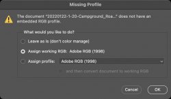
If you are referring to the image at the beginnig of the post from @thronobulax then the discrepency may be because the scanned image does not have an embedded profile which is going to make it difficult for browsers to render it properly.

Screenshot 2022-07-23 at 11.16.42.jpg
 
@thronobulax: Thanks for sharing your insights.

Interestingly, Steve Sherman doesn't seem to be targeting full film speed with EMA from what I understood reading his unblinkingeye article. He likes to generously overexpose and underdevelop. Of course, it doesn't mean that one shouldn't use EMA to get full speed like you do, but the tonality might not be the same. Any perspectives on this?
I agree with your assessment entirely. He is designing his negatives for his particular subject matter and vision. Also, the way he prints is different than me and requires a negative that works that way. I am split VC silver printing. I believe he is contact printing - perhaps on Platinum or Palladium? - not sure.

My primary interest is to achieve three things (in most cases):

  • Preserve shadow detail
  • Optimize mid-tone contrast
  • Rein in highlights to avoid excessive burning and dodging

I will say that when I end up with lower contrast/lower CI "thinner" negs than usual. They end up printing really well as in the plant picture above.
 
If you are referring to the image at the beginnig of the post from @thronobulax then the discrepency may be because the scanned image does not have an embedded profile which is going to make it difficult for browsers to render it properly.

View attachment 3411
An excellent point. I am going to have to figure out how to tell Vuescan to produce that profile when I scan.
 
An observation, after shooting many hundreds of rolls of 120 Fomapan 200 & 100, and many boxes of 5x4 and larger, why are you messing about trying to achieve something that's consistently giving you poorer results. It doesn't make sense.

Ian
 
An observation, after shooting many hundreds of rolls of 120 Fomapan 200 & 100, and many boxes of 5x4 and larger, why are you messing about trying to achieve something that's consistently giving you poorer results. It doesn't make sense.

Ian
Not sure to whom this addressed.
 
Back
Top