Were The Old Materials Better?

thronobulax

Very Active Poster
Registered User
Joined
Aug 29, 2020
Messages
1,334
We have, at our disposal, many of the lenses and even cameras used by our photographic forebears.

We do not have, to a large degree, the film and paper they used, though, of course, mostly we have much of the same chemistry.

I wonder if those old films and papers, combined with the larger formats in use, didn't actually produce better results? This was brought to mind as I took one of my seasonal tours through:


I look at these images and see a sharpness and tonality that is hard to achieve these days. Not in every instance, of course, but some of these are jaw-droppingly good. I wonder why.
 
I am 100% with you on this one, I have spent a lot of time trying to get the same look but just never achieved it.

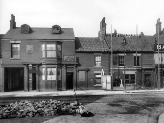
This is a photograph was taken in 1901 in my town by a local photographer at the time which I adore.

Doncaster-1901.jpg
 
Last edited:
What an excellent website! Thank you.
If the telescope were reversed, what would our photographic ancestors think of today’s materials. Surely they’d be very impressed by multi-grade and Multigrade techniques. They’d be delighted by only stocking one box of paper, instead of five. Who wouldn’t?
Film might be a different matter. The thicker emulsions seem to have been especially suitable for manipulation. Did they also encourage the formation of Mackie lines? Presumably they’d welcome the extra speed of modern films.
One thing that puzzles me is that they seemed to get more depth of field.
 
What an excellent website! Thank you.

Yes, I periodically revisit this site and go down the rabbit hole looking at the images. They serve both as a reminder of the past as well as being an inspiration for possible new work on my part.
If the telescope were reversed, what would our photographic ancestors think of today’s materials. Surely they’d be very impressed by multi-grade and Multigrade techniques. They’d be delighted by only stocking one box of paper, instead of five. Who wouldn’t?

I'm sure they would be fascinated by VC.

But ... I grew up in the heyday of graded papers in the late 1960s and beyond. Some of them were gorgeous with no modern equivalent. Yes, they were graded, but they had surface textures never again to be seen. I'm thinking, for example, of Kodak's G surface papers.

Then there was the color of the papers. I see no modern equivalent in VC for Kodabromide or Velox blue/black. Both were stunning.

More recently (30 years ago), there was the original Zone VI graded paper. It had a charcoal like black, toned flawlessly, and had a surface tooth like nothing I'd ever used before. It is - hands down - the finest graded paper I ever used.

(Both Bergger VCNB (now lost to us in the US) and Fomabrom Variant 111 VC FB come close, but it lack the weight and the surface texture that I prefer. I know that the Ilford papers are popular among many, but I've never found one I really loved.)

Film might be a different matter. The thicker emulsions seem to have been especially suitable for manipulation. Did they also encourage the formation of Mackie lines? Presumably they’d welcome the extra speed of modern films.
One thing that puzzles me is that they seemed to get more depth of field.

I'm not sure. @Ian Grant might have a perspective on this. What strikes me most, though, is: A) How sharp these images are and B) The incredible tonality. I don't think that's all attributable to digital post production of the scans.
 
What an excellent website! Thank you.
If the telescope were reversed, what would our photographic ancestors think of today’s materials. Surely they’d be very impressed by multi-grade and Multigrade techniques. They’d be delighted by only stocking one box of paper, instead of five. Who wouldn’t?
Film might be a different matter. The thicker emulsions seem to have been especially suitable for manipulation. Did they also encourage the formation of Mackie lines? Presumably they’d welcome the extra speed of modern films.
One thing that puzzles me is that they seemed to get more depth of field.

The major differences were in terms of exposure and development, and before about 1908 all plates and films were Orthochromatic. This usually led to bland almost blank skies. Fast plates/films were around 25 ISO in the early 1900s.

With no exposure meters, negatives were over exposed and usually developed to much higher contrast in Pyrogallol or MQ developers, which themselves were way stronger solutions than we use today. The advantage of the Pyro developer was they were self masking due to tanning the gelatin, they also gave strong edge effects.

In the early 1970s I had to make prints from early glass plates, it is not easy with modern papers. Ideally, you need POP papers, or make Ambrotypes or Kallitypes. These POP papers are also self masking, so you get a longer tonal range.

Kentmere used to do a coating run of POP paper once a year before their Christmas shutdown, then the coating line etc was cleaned over the holiday, to remove all traces of Silver Nitrate. Ilford decided not to make POP after taking over Kentmere on grounds of Health & Safety issues.

Some years ago I visited the Barbican to see the large Ansel Adams exhibition "Classic Images". In the theatre bar there was a Kertesz exhibition of his early pre WWII work, the prints were all small and contemporary, jewel like wonderful warm tonalities, the largest were around half plate. Some years later in Paris I saw a large exhibition of his work, the early images had been enlarged on modern paper and were lifeless compared to the originals.

Papers changed over the years to match newer ways of working, and improved plates and films.

Ian
 
On the subject of POP paper, we can make any contemporary silver gelatin paper function as a POP paper simply by treating it with either silver nitrate (4% solution) or sodium nitrite (10% solution) under safelight. A cotton ball can be used to apply the solution on the emulsion side of the paper. Once the paper is dry, it is ready to print-out and like POP papers of yore, it requires a negative with higher contrast and density range.
 
On the subject of POP paper, we can make any contemporary silver gelatin paper function as a POP paper simply by treating it with either silver nitrate (4% solution) or sodium nitrite (10% solution) under safelight. A cotton ball can be used to apply the solution on the emulsion side of the paper. Once the paper is dry, it is ready to print-out and like POP papers of yore, it requires a negative with higher contrast and density range.

However, that's not the same as a pure POP emulsion.

Ian
 
However, that's not the same as a pure POP emulsion.

Ian

Pure POP emulsion is typically a silver chloride emulsion with an excess of silver nitrate and optionally some citric acid/citrate. If we treat a chloride paper like Adox Lupex or Lodima with silver nitrate, we should get something very close. Even with chlorobromide papers we get the POP behaviour but the contrast and colour tone varies with the paper and the sensitiser. I think the situation is similar to that of Lithable papers. Today there are very few papers that are Lithable, but master printers like Tim Rudman and Wolfgang Moersch have shown that almost any contemporary paper can be made Lithable by using second pass Lith process and thereby expanding the options for printers.
 
How many folk singers do you need to take a large format photograph?

Three. One to carry the camera. One to take the picture. And one to write a folk song about why the old cameras were better.
 
I wonder if the colour sensitivity of both film and paper might have had an effect. A reduced spectrum would automatically reduce chromatic aberration, giving an increase in edge sharpness. The extent of this would depend on the exact sensitivity of the emulsions. would this effect be doubled when making a print?
Furthermore, colour in the subject would be rendered differently, giving a tonality to the image that’s unfamiliar and perhaps attractive to our modern eyes.
As for paper surface and colour, that baton has passed to inkjet paper.There’s a huge variety, but I can’t guarantee that you’ll like any of them. Tastes change, as we can see by f64 espousing very neutral blacks on very white paper, as a deliberate change from the brown smudges they disliked.
 
How many folk singers do you need to take a large format photograph?

Three. One to carry the camera. One to take the picture. And one to write a folk song about why the old cameras were better.

And one more to tell you they could have done it better and/or what you did wrong ;)
 
The colour sensitivity of the B&W paper is not important, the exception is when printing from Colour negatives where you need a Panchromatic paper like Kodak Panlure.

The research of C.E.K. Mees & his friend S.E. Shepard at Wratten & Wainwright on colour sensitisation from 1906 lead to their introduction of Colour sensitive plates in 1908 initially Allochrome, Verichrome, and Panchromatic. Mees had joined the company in 1906 as a partner and joint managing director.

Mees & Shepard were the first to produce fast Panchromatic materials, BJP Almanacs give details of baths for adding Panchromatic and Infra Red sensitisation to ordinary plates. Mees visited Rochester in 1909 and was taken around Eastman Park by George Eastman , who visited the Wratten factory in 1912. The result was Eastman buying the Wratten company,

It appears Panchromatic films became more common after WWI.

Ian
 
My thinking on the effect of spectral sensitivity of both film and paper was this.
Chromatic aberration would manifest itself as a rainbow fringe at any sharp edge. On a universally sensitive monochrome material, this would appear as blur. (This assumes that the incident light is more-or-less full spectrum, of course.)
If monochrome light were used for making the print or negative, this rainbow fringe would be absent and the image’s edges would consequently look sharper. Similarly, a material that was sensitive that one particular single colour would display the same effect.
However, I don’t know how strong this effect might be. We might expect to see it more strongly on even older, blue-sensitive materials. I’m thinking here of Atget. If you examine his original prints, they have a certain edge wiriness that doesn’t seem to survive reproduction.
 
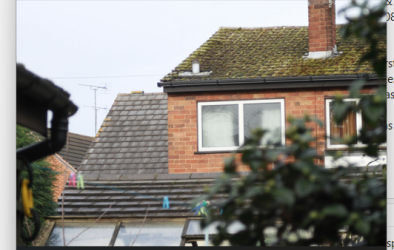
Well, this is the whole uncropped image from a DSLR made with a 1912 120mm f6.8 Dagor. The sensor size is 22.3mm x 14.9mm

1718545766551.jpeg

Yes, there is very slight Chromatic aberration, seen better by a right mouse click and opening the image in a new tab/window. Shot wide open and focussed on the window & brick work.

1718545671381.png

At this size, approx 12cm wide on my screen, this is the equivalent to a section from a 24"x20" enlargement if I'd used the lens on a 5x4 camera.

It's worth noting that the early Goerz Dagor lenses suffered Longitudinal Chromatic aberrations, so worse towards the edges. Newer Abbe glasses from Jena significantly lowered the aberrations.

I tested some other lenses at the same time, a 165mm f5.3 CZJ Tessar (the f5.3 version is rare), a 135mm f6.3Goerz-Ihagee Doppel Anastigmat, all in excellent condition optically. I was interested in contrast as well as sharpness, all 3 lenses are uncoated, As I'd expected the Dagor had excellent contrast, as there are only two internal air glass surfaces, there was a drop in contrast with the Tessar as it has 4 internal air/glass surfaces. The Goerz-Ihagee lens is a Dialyte, with 4 air spaced elements so 6 internal air/glass surfaces, so had the lowest contrast of all 3.

Ian
 
So, a fairly small effect, at best. Or worst.

I think it was worst with early fast lenses at wider apertures, particularly with small formats and greater enlargement.

Ian
 
Pure POP emulsion is typically a silver chloride emulsion with an excess of silver nitrate and optionally some citric acid/citrate. If we treat a chloride paper like Adox Lupex or Lodima with silver nitrate, we should get something very close. Even with chlorobromide papers we get the POP behaviour but the contrast and colour tone varies with the paper and the sensitiser. I think the situation is similar to that of Lithable papers. Today there are very few papers that are Lithable, but master printers like Tim Rudman and Wolfgang Moersch have shown that almost any contemporary paper can be made Lithable by using second pass Lith process and thereby expanding the options for printers.
ever feel like tossing us a few example prints? Be interesting to see. Also, would be interesting to see what the negatives look like with the added density.
 
Hi @bandeau_rouge,

As an example of modern paper made to print-out by treating with a sensitiser, you may want to check this work by Jalo Porkkala:

 
Last edited:
I have some glass negatives of the building of an Arkwright cotton mill in Derbyshire. I will try and compare them to a modern negative, on a makeshift light box, over the weekend.

Ian.
 
the technique does have viable results. And most seem to be in the "looks like a really early color photo" category.
 
Back
Top