The Lake Beckons

thronobulax

Very Active Poster
Registered User
Joined
Aug 29, 2020
Messages
1,368
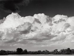
A lovely lake about 5km from my home that calls to me on a regular basis for photographic revisitation. The sky cooperated the other day...
 

Attachments

  • 20220721-1-15-The_Lake_Beckons.jpg
    20220721-1-15-The_Lake_Beckons.jpg
    122.2 KB · Views: 76
Thronobulax, you have done it again. Earlier today you were saying you have to develop a film for sixty minutes to get full film speed. Now, once again, you are showing us a photograph with not enough shadow detail. Most of the trees on the far side of the lake are full black. I can get plenty of shadow detail in negatives that have been developed much more simply than the methods you keep describing.
I know you will say it is a monitor problem. But what about the composition? That can't be a monitor problem. To my eye the very thin strip of lake at the bottom of the picture is simply nowhere near enough. My first reaction to the picture was "I want to see more lake".
I wouldn't mention this but it does say "critique my pictures" under your name.
 
I more than welcome you commentary and critique, so don't apologize. Let me respond in some detail.

First, be aware that this is my first pass at silver printing the image. Future versions may well look different as an interpretive matter.

Second, monitor calibration is more than just getting the color balance right. It's also about get a comment white- and black point settings so we're all looking at the same thing. On my monitor(s), the image shore/treeline is dark, but definitely shows detail.

Thirdly, as a matter of aesthetic choice I purposely wanted the sky to dominate the frame. The negative has a great deal of shore/treeline detail, but I chose to dispose of it. (You likely can confirm this, by downloading the jpg above and adjusting the brightness to see the tree line detail. At least the original here has it.) That meant minimizing the presence of a lake surface that has nothing going on (there are no boats or other visual structures thereon) and printing down the treeline so that it acts as a visual divider. As I said, if/when I revisit this, I may reconsider some of those decisions.

And finally, an observation. In my early career as a printer, I sought to rigorously follow the maxims of St. Ansel and his acolytes - every zone was to be present in every image spread as linearly as possible. But as I matured in my work, I realized that the negative should capture as much as possible, but the print was free to dispose of anything I thought was visually in the way and thus allowed to go pure white or black (or close to it). These days when I look at my own older work and the work of others who are determined to hold the entire range of light with stubborn regularity, I frequently find very static, uncompelling pictures that are technically flawless but have a boring aesthetic. By contrast (pardon the pun), when I look at thing's like Brassai's Montmartre photos - which are amazing - I see jet black particularly in places one might expect detail.

P.S. In actual fact, the silver printer has to do this because the negative is capable of a far greater dynamic range than any silver paper nearly all monitors. Of necessity, when we render a negative, we are picking and choosing the parts of the dynamic range that we want reproduced, and it won't be all it. (If memory serves, a silver print is good for something like 5-6 stops SBR, but a negative can hold over 14 stops, albeit in a non-linear way. Your typical monitor can only handle 8- or so stops, and you have to go to a high end, carefully calibrated monitor with a 12 bit LUT and a complementary video system to get more.)
 
Last edited:
Most of the trees on the far side of the lake are full black.
I don’t agree with that. On my iPad and laptop there is full detail in all the trees on the shoreline apart from the largest tree just left of centre.
 
I don’t agree with that. On my iPad and laptop there is full detail in all the trees on the shoreline apart from the largest tree just left of centre.
Hi Bill. Thronobulax has said that although there were details in the shadows in the negative, he chose to print these down. So if you are seeing full detail in the trees, maybe your monitor needs adjusting. This is confusing, I know. He has gone to great lengths to describe how his long and elaborate film development process delivers full film speed- and by implication, full shadow detail. Then to illustrate this he chooses to show us a photograph that is deliberately printed to get rid of that shadow detail.
To be honest, I am beginning to lose interest in all this. His writes very well, but his photographs don't quite get there....
 
As mentioned before, we have to be aware of many variables when both posting and viewing on a screen in a browser.

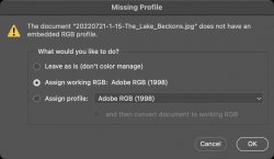
The above image in question does not have a color profile embedded into the file which on modern browsers is going to have an impact.

Screenshot 2022-07-29 at 11.26.16.jpg

Also we have to be concious of the screen we are viewing on. I see it many times where people are trying to critique an image on a screen which has never been calibrated, Phones and certain tablets are the worse as these are unabled to be properly hardware calibrated.

There is also the parameters used in the scanning software to be concidered as these can impact the way in which the final image is display in a digital form.
 
Last edited:
My word! Yes. We used to call that soot-and-whitewash when I were nobbut a lad.
But in the context of this discussion, not a good way to get extensive shadow detail. If it’s present in the neg, he’s chosen to obliterate in printing. In which case, why use a non-standard process?
 
Hi Bill. Thronobulax has said that although there were details in the shadows in the negative, he chose to print these down. So if you are seeing full detail in the trees, maybe your monitor needs adjusting. This is confusing, I know. He has gone to great lengths to describe how his long and elaborate film development process delivers full film speed- and by implication, full shadow detail. Then to illustrate this he chooses to show us a photograph that is deliberately printed to get rid of that shadow detail.
To be honest, I am beginning to lose interest in all this. His writes very well, but his photographs don't quite get there....
But the image was presented on its own merits, not part of the discussion of how I develop.
 
Normal is of course open to interpretation, but encompasses images with a wider or fuller range of tones than the examples being discussed here with a deliberately limited shadow and mid tones.. Or as put above, "soot-and-whitewash"

Ian
 
Normal is of course open to interpretation, but encompasses images with a wider or fuller range of tones than the examples being discussed here with a deliberately limited shadow and mid tones.. Or as put above, "soot-and-whitewash"

Ian
The history of all art, let alone photography, leaves a much wider range of interpretation available. By your definitions, the work of Brassai, Man Ray, Atget, Minor White, Salgato, Lange, the Westons, and, yes, even some of St. Ansel's output would not be "normal". I daresay all of the above are far better artists than anyone here present.

This "all zones should be there in some degree" is the disease of people taking the technique of Zone System so literally that they think it's a method for artistic expression. It isn't. It's a way to design and control negatives which then can be mapped onto an output medium in the artist's preferred way. This "all zones must be present theory" is responsible for some of the most unimaginably boring imagery to be found in our craft. It's also responsible some wonderful imagery. What is it not - now, nor has it ever been - is a definitive statement of "normal".

I say all this having passed through that disease myself at an earlier stage of my photographic development. Every print was built attempting to render every possible range of light available. I look back at those prints and now see them for what they really were: Exercises in technique building.

As I am always willing to have people criticize my own work, here's an example of very limited tonal range that very my suits my own artistic instincts. Others share an appreciation of this image. By your definition, it's not "normal". I guess that's good - I seek, however imperfectly, to try to do much better than just "normal" work...

1659105976521.png

P.S. In the negative, there is quite a bit of detail in the jet black triangular area center right. I chose to force it to pure black. It's not "normal".
 
Last edited:
The history of all art, let alone photography, leaves a much wider range of interpretation available. By your definitions, the work of Brassai, Man Ray, Atget, Minor White, Salgato, Lange, the Westons, and, yes, even some of St. Ansel's output would not be "normal". I daresay all of the above are far better artists than anyone here present.

Having seen original contemporary prints by all but "Salgato" numerous times, they encompass what most of us would consider normal, some of Man Ray's work is more experimental. I have seen Salgado's work as well

This "all zones should be there in some degree" is the disease of people taking the technique of Zone System so literally that they think it's a method for artistic expression. It isn't. It's a way to design and control negatives which then can be mapped onto an output medium in the artist's preferred way. This "all zones must be present theory" is responsible for some of the most unimaginably boring imagery to be found in our craft. It's also responsible some wonderful imagery. What is it not - now, nor has it ever been - is a definitive statement of "normal".

I say all this having passed through that disease myself at an earlier stage of my photographic development. Every print was built attempting to render every possible range of light available. I look back at those prints and now see them for what they really were: Exercises in technique building.

No, a full range of tones does not need to be present, you need to look at the work of John Blakemore, very high key in some cases with almost no shadow detail, and the reverse as well.

We are talking about an extreme, as David M said "We used to call that soot-and-whitewash when I were nobbut a lad". Sure it works for some images but not for all.

Ian
 
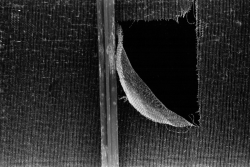
Surely, the picture of the mesh does display an almost complete range of tones, excepting perhaps, pure white. It’s the subject which isn’t “normal“ not the print.
This print’s tones will not generate a bell curve. On the other hand, it’s not an extraordinary subject; we’ve all seen broken mesh. Lee Miller made an extraordinary image of it.
Despite the difficulty of constructing an exact definition, and in particular a numerical one based on the distribution of negative densities, I suggest that anyone here could look at a print and say if it was normal.
Or not. Even the laity might look at Moonrise (sorry, I have to offer a well-known example) and be aware that something besides simple representation was going on. They would have little difficulty with the Karcher images.
For examples of “normal” we might care to look at the kinds of helpful leaflet that Kodak used to publish for amateurs.
 
Well, at the very least, all this chatting has encouraged me to go back and revisit the lake photo and bring back some of the shoreline detail to see what the resulting aesthetic looks like. That's the purpose of critique' - to challenge the work to make it better. And, for that, I am most grateful you've respectively donated your time to comment, poke, prod, and - perhaps - sneer ;)
 
That’s the one. I didn’t know about the crop. Thank you. She has made a memorable image out of nothing. We can understand why she would have shot the first one, and why she decided to make the crop.

A small but peripheral comment, if I may be excused. I was born in the North of England. People there take great pride in speaking plainly - “calling a spade a spade”. This can be misinterpreted.
 
After the preceding excitement, may I critique the actual lake picture, putting aside questions of development?

I'm bearing in mind that this is a first proof amd intended for revision, not a final fine print, ready for framing.
My first impression is that someone has been very entusiastic about the red filter. Should this be the first thing to cross my mind? When I enlarge the image and turn the brightness up to eleven, I can see evidence of burning in the top half of the sky. It could be done more dextrously, but this is a first proof.
Turning to the trees, at maximum screen brightness (uncomfortable to my eyes) there is much more detail in that tree line, but still some undetailed blacks. This is a obviously matter of choice, but I'd have preferred more.
Now, the lake itself, which is specifically mentioned. I too think that such a narrow bright strip is uncomfortable and a little more lake with a little less black sky (if we want to preserve the proportions) would suit me better – a little more lake anyway. As it stands, it takes a moment to decide that it is in fact a lake and not, for instance, a field of some light-coloured vegetation, or even sand. I don't think a boat is needed to justify this, it's a question of proportion, not visual incident. There is, after all, no plane or bird in the expanse of dark sky either.
Alternatively, it could be printed little less bright so as not to compete with those bright clouds, which seem to be the main point of the picture.
Curiosity then drove me to try cropping off that little bright strip and the composition came to life. The tree line now echoed the cloud line and the simplified composition hung together better. You may differ, of course. These matters are personal.

As promised, no comment on development.

Added later: Oops! I missed it. There is a boat, very small, halfway between the prominent trees on the left and the edge of the frame.
 
Last edited:
Back
Top