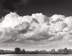
The Lake Beckons

After the preceding excitement, may I critique the actual lake picture, putting aside questions of development?

I'm bearing in mind that this is a first proof amd intended for revision, not a final fine print, ready for framing.
My first impression is that someone has been very entusiastic about the red filter. Should this be the first thing to cross my mind? When I enlarge the image and turn the brightness up to eleven, I can see evidence of burning in the top half of the sky. It could be done more dextrously, but this is a first proof.
Turning to the trees, at maximum screen brightness (uncomfortable to my eyes) there is much more detail in that tree line, but still some undetailed blacks. This is a obviously matter of choice, but I'd have preferred more.
Now, the lake itself, which is specifically mentioned. I too think that such a narrow bright strip is uncomfortable and a little more lake with a little less black sky (if we want to preserve the proportions) would suit me better – a little more lake anyway. As it stands, it takes a moment to decide that it is in fact a lake and not, for instance, a field of some light-coloured vegetation, or even sand. I don't think a boat is needed to justify this, it's a question of proportion, not visual incident. There is, after all, no plane or bird in the expanse of dark sky either.
Alternatively, it could be printed little less bright so as not to compete with those bright clouds, which seem to be the main point of the picture.
Curiosity then drove me to try cropping off that little bright strip and the composition came to life. The tree line now echoed the cloud line and the simplified composition hung together better. You may differ, of course. These matters are personal.

As promised, no comment on development.

Added later: Oops! I missed it. There is a boat, very small, halfway between the prominent trees on the left and the edge of the frame.
No red filter (or any filter) was used.

I'll look at removing the lake foreground as suggested when I reprint.
 
Well, to be pedantic, my remark was that this was the first thing that came into my head, not that that was how it was done. It’s certainly very dark. My apologies for the over-interpretation.
Nevertheless, however it came about, my point was that the dark sky was the dominant impression on my mind on first viewing. My question was if this is what you wanted.
I’m looking forward to the next one.

An afterthought: I wonder if the desire for more detail in the trees stems from the fact that the clouds are so exceptionally well-detailed.
 
Last edited:
Well, to be pedantic, my remark was that this was the first thing that came into my head, not that that was how it was done. It’s certainly very dark. My apologies for the over-interpretation.
Nevertheless, however it came about, my point was that the dark sky was the dominant impression on my mind on first viewing. My question was if this is what you wanted.
I’m looking forward to the next one.

An afterthought: I wonder if the desire for more detail in the trees stems from the fact that the clouds are so exceptionally well-detailed.


Keep in mind that my sensibility is not to record a scene with realistic fidelity, but to manipulate it for creative purposes. So, yes, I split VC printed this to darken the sky and give it more "pop". This is an interpretive choice not everyone will love because it can appear contrived to some eyes.

I thought your afterthought was thoughtful now that I think about it ;)

Heading into the Room Of Darkness shortly...
 
Keep in mind that my sensibility is not to record a scene with realistic fidelity, but to manipulate it for creative purposes.

Without a strong composition where the foreground complements the overbearing clouds in a visually interesting way to create something more than the sum of the parts, tonal manipulation alone might not help much.

If the idea was to showcase the patterns in the clouds, then there's a lot of dead space in the top and the trees and lake in the bottom are not helping either. But the clouds are themselves nothing extraordinary though they are detailed. Not everything detailed is visually interesting.

I look forward to your iterations and applaud you for taking criticism in the right spirit.
 
I look forward to your iterations and applaud you for taking criticism in the right spirit.

I am a computer scientist by profession wherein peer review of the work is an ordinary thing. We have a saying that I think applies here: You are not your code. That is, when receiving criticism, one shouldn't take it personally, but rather see it as a means to improving the final product. (There are, of course, those who engage in personal invective and internet flaming. They are best handled by being ignored.)

All this does put in mind of an old joke:

Q: How many photographers does it take to make a fine print?

A: 14

1 to take the picture and make the print
3 to provide detailed commentary for improvements
10 to say they could have done it much better
 
How many folk singers does it take to change a bulb in your enlarger?
Three.
One to change the bulb, and two to write a folk song about why the old bulb was better.
 
Only ten to say they could have done it better? You live in a kindly world.

I agree that for our purposes, the final print shouldn’t simply be a catalogue of all the tones in the scene.

I hadn’t encountered “You are not your code.” Clearly it can be expanded into “You are not your XXX.”

Because I have a larger printer, I sometimes make prints for a friend. He often seems surprised at my frankness when dealing with his image on screen, but I tell him: “This is Work.”
There seems to me to be little point in equivocation in a work situation. In social life, yes, but honesty seems the only policy when making things. I should add that a willingness to listen and be persuaded by other considerations is equally necessary.

And now, another thought on the lake. Compositionally, it’s a bright patch on the edge of the frame that competes visually with the clouds. To my eye, it’s not big enough to explain itself. It’s there because it was there. I wasn’t there and neither were all your other commentators, so there may have been hard decisions to make.
Thank you for letting us loose on you image.
 
And now, another thought on the lake. Compositionally, it’s a bright patch on the edge of the frame that competes visually with the clouds. To my eye, it’s not big enough to explain itself. It’s there because it was there. I wasn’t there and neither were all your other commentators, so there may have been hard decisions to make.
Thank you for letting us loose on you image.

I revisited this negative yesterday and made some incremental changes, but I am still not yet there. Removing the strip of water entirely unbalances the image - at least to my taste. I did lighten the shoreline and - as I mentioned - there is plenty of shadow detail to be seen, even a slight amount under the tree at frame left. I think the remaining work is to darken the water from shoreline down somewhat so that it acts as a visual boundary but is still clearly water.
 
I find the Adams work - at least this one - terribly uninteresting. The Stieglitz stuff is much more compelling to my eye. I note with some irony that he too let foreground detail go nearly jet black to highlight the clouds.
 
Stieglitz's print quality is not particularly good, so in that sense don't read too much into it. I was referring more to the cloudscapes, and maybe the issue here is the subject is actually the clouds, including so little of the lake makes it irrelevant. It's a stronger image with no water, but needs some dodging to even up the left compared to the right.

Ian
 
So here is my likely final rendering. I did lighten the shoreline and darkened the water, but removing the water entirely was - to my eye - too unbalanced an image:

1659966441722.png
 
Last edited:
That seems to show off the clouds much better. A valuable exercise for us all.
 
I'm unable to access OP's website. I would appreciate if he can post his work here like he did earlier.
 
I like that, lovely image, I would have included another half inch or so of water I think, but that's just me.
 
I like that, lovely image, I would have included another half inch or so of water I think, but that's just me.

Funny thing how all of us see differently. Some here think the existing band of water is already too distracting ;)

Let me share my rationale' for the composition as-is. When I composed, I noted the darker cloud in the upper left that I wanted to capture. I also knew that when I split-VC printed this, I could make the sky go blacker than it was in reality, so I composed for the clouds to be suspended between the sky and the earth.

I did not add more water to the foreground because, although I saw it as a framing element, it is very static. If, instead, I'd have been shooting over a running river or brook to get to the clouds, I would have backed up and used sufficient exposure time to give the image a sense of motion. Adding more static water to the foreground would have - IMHO - deadened the image.

I hasten to add that this is just how I see the world, it's not some immutable truth of composition. Everyone's mileage varies and that's what makes artistic expression so personal and rich.
 
We might care to note that this discussion, on the aesthetics of an actual image, has attracted far more views than anything about the exact amount of eye of newt to use.
Well done. Long may it continue.
 
We might care to note that this discussion, on the aesthetics of an actual image, has attracted far more views than anything about the exact amount of eye of newt to use.
Well done. Long may it continue.

I beg your pardon, sir - the Eye Of Newt in my possession is worthy of admiration, curation, discussion, and most of all, incantation....
 
Back
Top