How do you increase contrast when photographing trees, trunks, logs etc

When I did my Zone System testing initially back in the 1980s I had switched from FP4 to Agfapan AP100 with Tmax 100 as a back up, and also Tmax 400 for handheld MF work.

I found I had to rate the 2 Tmax films at half box speed, this matched two John Sexton article in some US Darkroom Techniques magazines I was given a few months later. I always shot Agfapan AP100, and later APX100 at box speed for normal developments.

Around 20 years ago I switched to Ilford Dela 100 & 400, & HP5 for hand held LF because getting Tmax films (or any Kodak B&W film) was near impossible while living abroad. Ilford & Foma films were easy to get, I found the same on a trip to Chile & Peru

I've written before I had to do my Foma effective film speed & development time times tests visually, as I processed my films in our bathroom, and had no access to a darkroom, At the time Foma 120 films were on a bluish base but visual comparisons to Tmax & Delta 100 negatives worked well, when I did print the Foma films back in the UK it was the same contrast settings as my other films.

With both Fomapan 100 & 200 I shoot at half box speed and also develop at about 75% of the times I use for other films.

Ian

The challenge here is that each of us see shadow placement somewhat differently. Assuming substantially correct meters, shutters, thermometers, etc., one person may choose less shadow detail (effectively a higher EI) than another for a given scene.

In some degree, this is why I abandoned testing every new thing to death. Each of us have our own creative ideas and I think it better (these days) to start with a known working point and evolve from their to mach our own opinions about shadows and highlights.
 
Long exposures can increase contrast slightly but not enough to worry about if printing on VC paper

You may have to worry about highlights blowing out, if "long exposures" means some extra exposure. Or do you mean "longer than one second"?

This video guy starts with a development for "full sunny days", and describes this as "standard contrast". This may be HIS standard contrast, but full sunny days will give brightest light and "full shadowed shadows", so a high, if not extremely high contrast. This requires shorter development times. Zone people would talk about minus 2 or minus 3 stops. Which may be HIS normal dev time concerning his usual contrasts.
He uses a compensating developer which may be a good choice for high contrast scenes, but compensating is somehow compressing the contrast like shorter devevelopments.
Pyro gives extra dense by staining, another compensating factor.
To me, this all conflicts with the term "standard". This is a kind of N- development of high contrast negatives.

Unfortunately he doesn't show comparisms of the whole project, but seeing the three given prints makes me wonder concerning highlights- and shadows behaviour...


Underdevelopment gives a thin negative that can be used with higher contrast filters in the enlarger to get better tonal separation between shadow and mid tones.

Underdevelopment is a not lucky accident; better let's talk about reduced development.
For tonal rich of the midtones together with darker/more separated shadows the splitgrade technique is a nice tool. You also could shift nearly everything: shadows, mids, highlights. A wonderful tool - you want to print down your shadows to mostly black with grade V filter, followed by bringing in finest highlights (maybe combined with preflashing?) with grade 0 Filter.? Set less or extra contrast in any region of the print.. Two filters, all-in.

There are other contrast raising technics within the printing stage. Par example, try printing way darker, then bleaching the print overall, with Farmer's Reducer. Will give a somehow Rembrandtish atmosphere :)
One can do a selective bleach, too, for partial contrast.

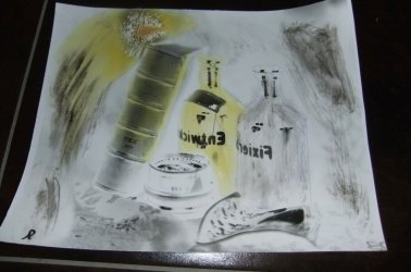
For my paper negatives I love to create masks, then copying neg and print, maybe again - its a creative dodging/burning job, I can bring in details to blank shdow or highlight areas, if using colours or pencils/brushs.

That's an increased 12x16" paper negative with no details in the blank bottles (depending on the orthochromatic behaviour of paper) :

Neg.jpg
 
That’s a good question.
When discussions of precise negative practice delve deeply into the minutae of the subject, I often think that the purpose of all this effort has been forgotten.
The print is the final arbiter of success.
So, a “known working point” would be a successful print, particularly an “ordinary” one. By that I mean (for example) no brides in snow or black cats in coal cellars. Preferably it would have needed little or no manipulation in printing. That would be another quest.
Take that print as a starting point and work backwards to how it was made. Tracking several prints in this way would yield greater certainty.
 
Personally I chose a starting point based on what's in the film manufacturers data sheets, and experience, it's a balance. I haven't had the time to do Zone System tests for every film I've used, particularly when switching from Tmax 100 & 400 to Ilford Delta 100 (MF & 5x4) & 400 (MF), and HP5 (LF), while living abroad.

Comparison works well, particularly negatives shot in similar lighting conditions.

The print is the final arbiter of success.
So, a “known working point” would be a successful print, particularly an “ordinary” one. By that I mean (for example) no brides in snow or black cats in coal cellars. Preferably it would have needed little or no manipulation in printing. That would be another quest.
Take that print as a starting point and work backwards to how it was made. Tracking several prints in this way would yield greater certainty.

It's the prints that matter.

I was thinking of images in a current Exhibition set, mad over a period of 14 years (roughly), on 3 different occasions at the same place, Wheal Coates engine house in Cornwall, near St Agnes. I know at least 2 different films were used Tmax 100 the first time,& Delta 100 later, possibly HP5. Some images are 120 (6x6), most are 5x4, but looking at them you might initially think they were all made on the same day, a closer look the light direction is different.

It's about control, craft, about 40 years ago when I was first exploring the Zone System, I photographed a little iron bridge made by apprentices at a local Iron works 17th or 18th C, I had a sunny summer evening shot, and a foggy, frosty, winter shot, as a diptych in the same frame, they worked perfectly together.

Ian
 
When discussions of precise negative practice delve deeply into the minutae of the subject, I often think that the purpose of all this effort has been forgotten.
The print is the final arbiter of success.

Good point, but where does it come from?
I haven't had good success with reading my prints, and further fiddling without knowledge.It has been a path of sorrows :).
I believe it comes from photographic basics - blacks socks with slightly details come from certain exposure to zone II, and highlights with details come from determined development, depending on subject contrast. Do I have to test a bit for meeting the right times? Yes. But testing a bit, I'm not a total zone freak, will save me money and time later. This is what I have learned after wasting time and materials..

But. With a somehow good enough negative I also had to learn about my paper's behaviour, because good negatives not neccessary will print well with different papers. It depends on individul paper characteristcs. Further testing for further success.

All in all I have to say that with the zonal dictionary in my toolbox things became more easy, and splitgrade printing technic has been a game changer. Not so in giving master prints but but in bringing in more possibilities, and more timesaving comfort.
 
Last edited:
Back
Top